Saturday, 3 November 2012

Canvas & self branding

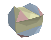
above is my canvas design, miss queenie asked us to incorporate self branding into it, so i got my inspiration from color wheel, where my logo is in the middle, and that white cube is like a prism, and it helps to refract light, therefore many colors are made, like a spectrum..

and these are posters where i have combined my logo+copywriting to give more meaning and depth to my posters..

3D progress

I had to do 2 new work for my 3D, and it took quite a lot of my time, not to mention my computer is also very laggy.. i used almost a week to model this.. 


it is a character from the game Portal 2..


 my 2nd work for 3D was at first a robot panther/jaguar. but then I've already had 2 robots(spider & above) so i decided to do a photorealistic kind of 3D, something new which I've never tried in class before. I initially wanted to do a jellyfish model and render them underwater, but then i changed my mind. I decided to model an object that is used in daily life, so my theme is to model different glasses/drinks that are placed in different environments. glass of water at home - wine by the pool - whisky at a hotel bar.... below are what I've rendered;


Friday, 26 October 2012


for my 3D i have decided and started to model robots such as these


above are my previous poster design, below is the latest one, however still need changes


Wednesday, 3 October 2012

Vertex Poster

we were required to design a poster for Vertex, miss Queenie suggested that we get reference from infographic posters, here are some of the references;


and this is the poster i came up with; i try to keep it simple so that it would be easier to read the text
and it still needs improvement, will update again once i've done changes on it ^^


Friday, 21 September 2012

Timeline

Here are some of the things that I would be doing for my portfolio;
1. Self Branding - website
2. web design - Candylicious
3. Corporate Identity x 2
4. Posters
5. Photography - combined with self branding
6. 3D
7. Motion Graphic
8. Vertex Design

Tuesday, 4 September 2012

Changes in logo


Above is the first design for Vertex, below is the new logo after some changes. It is a polygon with 7 vertices. 

I added some lines in the polygon to create another 7 more triangles in it, which the logo would now have 14 triangles, representing the number of students we have in our class.


Vertex;
  1. The highest point; the top or apex.
  2. The crown of the head
To me, Vertex represents the peak, and I find it suitable to be our exhibition name because it represents us, as it is the highest point in our college life where we would be showcasing our best artwork and effort.


We were required to create a logo which represents Vertex for our exhibition, Vertex means the highest point or a corner where the lines meet.. 

above are some of the googled images of vertex.

So, I came up with a polygon and added more lines/triangles in it, then I looked for a modern/techno font with sharp edges. The font which I'm using is Agero. I also added triangles after creating an outline of the text.


I have chosen it to be blue in color because I believe this color is very universal, accepted by both men and women. Blue is also a corporate color, and shows professionalism, without being overly serious.


This is the end result..

Here are other logos which I have designed as well;