Timeline
Here are some of the things that I would be doing for my portfolio;
1. Self Branding - website
2. web design - Candylicious
3. Corporate Identity x 2
4. Posters
5. Photography - combined with self branding
6. 3D
7. Motion Graphic
8. Vertex Design
Friday, 21 September 2012
Tuesday, 4 September 2012
Changes in logo
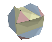
Above is the first design for Vertex, below is the new logo after some changes. It is a polygon with 7 vertices.
I added some lines in the polygon to create another 7 more triangles in it, which the logo would now have 14 triangles, representing the number of students we have in our class.
Vertex;

- The highest point; the top or apex.
- The crown of the head
We were required to create a logo which represents Vertex for our exhibition, Vertex means the highest point or a corner where the lines meet..
above are some of the googled images of vertex.
So, I came up with a polygon and added more lines/triangles in it, then I looked for a modern/techno font with sharp edges. The font which I'm using is Agero. I also added triangles after creating an outline of the text.

I have chosen it to be blue in color because I believe this color is very universal, accepted by both men and women. Blue is also a corporate color, and shows professionalism, without being overly serious.
This is the end result..
Here are other logos which I have designed as well;
Subscribe to:
Comments (Atom)


